Is stockcoinexchange.net Legit Or Scam? : Scam Bro...
stockcoinexchange.net SCAM REVIEW
|
|
|
|
Technical analysts study chart patterns because they give a good indication of market behavior. Certain chart patterns also give a signal if the trend will be changing direction.
The main chart patterns we will look at are reversal patterns and continuation patterns.
Reversal patterns indicate that an important reversal in the trend is taking place. Continuation patterns suggest that the trend is only temporarily pausing for a correction and will most likely continue in the same direction.
A prerequisite for any price pattern is the existence of a prior trend. The first signal of an impending trend reversal or continuation is often the breaking of an important trend line. The longer a pattern takes to complete and the greater the price fluctuations within it, the more substantial the subsequent move is likely to be. Reversal patterns take much longer to form than continuation patterns.
We begin our study with reversal patterns.
A reversal pattern is a transitional phase that marks the turning point between a rising and a falling market. If prices have been advancing, the enthusiasm of buyers has outweighed the pessimism of sellers up to this point, and prices have risen accordingly.
During the transition phase, the balance becomes more or less even until finally, for one reason or another, it is tipped in a new direction as the relative weight of selling pushes the trend down. At the termination of a falling market, the reverse process occurs.
Imagine a fast moving train, which takes a long time to slow down and then goes into reverse. The same is normally true of financial markets!
The most important reversal patterns are:
The head and shoulders pattern is one of the most famous and most recognizable of all reversal patterns. It must be noted that there must be an existing prior trend to reverse in order for the pattern to be valid. 
Referring to the chart above, we can see a head and shoulders pattern. Prior to this pattern there was an uptrend. Prices are rallying higher with greater momentum to create the highest peak which is called the head. The lower peaks on either side of the head are called shoulders. A neckline is drawn by connecting the lowest points of the two troughs on either side of the head.
As prices breakout and fall below the neckline at the right shoulder, this signifies a reversal in the prior trend. A downtrend now takes place.
In this chart formation, a sell position can be entered at the breakout point below the neckline.
Now let us take an example of an inverse head and shoulders pattern. It works the same way as a normal head and shoulders pattern, the only difference is that the head is upside down!

By looking at the chart, we can see that there was a downtrend, with the head making the lowest low. Prices subsequently failed to make a lower low, hence we have the right shoulder. Then prices penetrated the neckline, to reverse to an uptrend. Notice how prices found support at the neckline level.
A buy positioncould be entered at the break out point from the neckline.
Price Target
Once we have identified the head and shoulders pattern and confirmed that the trend has reversed, we can also use this pattern to find our price target. The method we use is to take the vertical distance from the head to the neckline. Next we go to the breakout point on the neckline and project this distance from there. The price target is an approximation of the possible distance that prices will move.
Look at the example below.
The length of the red vertical line from the neckline to the head is projected from the breakout point of the neckline downwards. This will give an approximate price target. So if you enter a sell position at the breakout point, your exit would be at this target level.

The same method applies to the inverse head and shoulders. If you entered a buy position at the breakout point, you can calculate the target price where you can exit and close your position with profit.

Double Tops
The double top pattern is another type of reversal pattern which has two peaks at about the same level. These are the highest peaks reached after an uptrend, where prices find strong resistance. Double top patterns signal a reversal from an uptrend to a downtrend.
When prices are rallying higher in an uptrend, they reach the first top peak then retrace slightly to find a support level before bouncing back up.
Prices are unable to rise higher than the first peak and find strong resistance at the price level reached by the first peak. Subsequently prices fall back down. After testing the resistance level for the second time, prices fall back down and penetrate the neckline. This is when we have the double top pattern and the reversal in the trend is confirmed.
Just below the breakout point you have the opportunity to enter a sell position.
Look at the example in the chart below. USDJPY began to lose strength as the double top chart pattern formed and this resulted in a price reversal.

Price Target
Just like in the head and shoulders situation, it is possible to calculate a price target in the double tops case after prices breakout and we have a trend reversal.
You would measure the distance from the neck line to the peak and take that distance and project downwards from the neckline. This would give you the minimum distance prices will move. In this case, USDJPY fell further from the target price level and you would have made a nice profit!

Double Bottoms
The double bottoms chart pattern is a reversal pattern that signals a change in price direction. It is basically the opposite of a double top reversal pattern. This pattern signals the reversal of a downtrend into an uptrend.
The image below demonstrates clearly that a double bottom pattern is easily recognizable since it looks like the letter “W”.

A double bottom pattern usually forms in a situation when sellers are battling against buyers but sellers eventually fail to be in control. More buyers enter the market and push prices higher.
During a downtrend prices are reaching new lows until they find support which prevents prices from falling further. This creates the first bottom which is the lowest level. Prices soon bounce off support and retrace up to a resistance level. When prices fail to break resistance, there will be another sell off to the previous low. The re-test of the support forms the double bottom on the chart pattern. Subsequently prices climb higher after failing to break support. The double bottom formation is completed when prices break above the neckline resistance level.
Let us look at an example of a double bottom pattern. In the chart below, we have EURAUD in a downtrend. The pair weakened its fall and a double bottom pattern formed, with prices subsequently reversing to move upwards.
An opportunity to buy occurred just above the neckline when prices breakout above it.

Price Target
Just like in the double tops situation, it is possible to calculate a price target in the double bottoms pattern after prices breakout and we have a trend reversal.
You would measure the distance from the level of the two bottoms to the neck line and take that distance and project it upwards from the neckline. This would give you the minimum distance prices will move.
We can see that the price target was reached in this scenario. If you entered a buy position at the breakout and exited at the price target you would have made a good profit!

Triple Tops
The triple top chart pattern is similar to the double top. It is also a bearish reversal pattern with the difference being that there are three “tops”, as the name suggests.
All three tops should be approximately at an equal level. It does not have to be exact, but very close. These three highs create a “resistance” level. Hence, prices rally to this level and test it three times. Prices are unable to break resistance and eventually reverse direction and the trend becomes a down trend.
During the formation of the pattern, a support level was also formed, which prices bounced off when attempting to rally but met resistance and fell back down to this support level. The triple top reversal is completed only until this support level is broken to the downside. This confirms the reversal of the prior uptrend. Upon breaking the support line, this is a good opportunity to enter a short position.

Measuring the Price Target
Measure the vertical distance from the highest peak to the lower bottom between the three tops. Use this same distance and project it downward from the breakout point at the support line.

Triple Bottoms
The triple bottom chart formation is the exact opposite of the triple top pattern. It is a bullish reversal pattern, meaning it shows the reversal of the prior downtrend to an uptrend.
During the formation of the pattern, prices which are in a downtrend reach a strong support level which they attempt to break three times. This results in the formation of three troughs, or bottoms, hence giving the name triple bottom.
These three troughs are at around the same level and form the support line. Each time prices attempt to break the support line, they bounce back up to the resistance line. Once prices breakout from this resistance line to the upside, the pattern is complete and the trend is confirmed to have reversed.

Measuring the Price Target
Measuring the price target is similar to that with the double bottoms pattern. Take the vertical distance between the lowest bottom and highest peak and project that distance upwards from the breakout point at the resistance line.

Most spike reversal patterns also called V-Reversal patterns are formed after a sharp previous trend. Prices reverse direction without giving any signals and as such this is known as the market turning on a dime. This situation is difficult to trade and it is best to stay out of the market.
Sometimes when a spike occurs the only recourse we may have is to check oscillators that show if the market was over-extended.

The rounding bottom saucer pattern is another type of reversal pattern. Unlike the spike reversal pattern, it takes longer to form and prices change direction very gradually. Saucers are usually spotted on weekly or monthly charts that span several years.

stockcoinexchange.net SCAM REVIEW
www.apexmarkets-plus.com scam review
mintonblock scam review
EARNBIT SMART CONTRACTS RECOVERY
ace-capitalfx.com scam review
Continuation chart patterns are formations that show sideways price action. Unlike reversal patterns...

The market does not move in a continuous straight line but rather in a zigzag pattern, creating peak...
Before you start trading, you need to identify the trend of the market. This involves finding the ge...

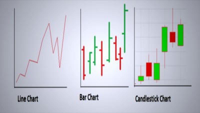
Different chart types can help you analyze price action, the three most commonly used being

A popular way of analyzing the markets is through technical analysis. This method uses charts to stu...
So far you have learned about forex and the basics. You have also decided that forex trading is your...

Want to know the best trading tips today to use to your advantage in the Forex market? This article ...
Now you know the basics, you have chosen your broker, and you are even ready to open a demo account....

Also called trading software, a trading platform is computer software through which you conduct your...
The market is full of online brokers – and each one claims to be the best.

Forex has its own language, that is, special terminology. If you don’t want to be embarrassed ...
The beauty of forex, among other things, is that you can do it anywhere, anytime and you are free to...

Now you are a bit closer to forex: you know what it is, how you can benefit from it and who the mark...

There are various players in the Foreign Exchange Forex market and all of them are important in one ...

The forex market is unique – and as such, it attracts millions of traders daily, who are busy maki...